
Spend Analytics Graphs

Spend Analytic Graphs
Spend Analysis Graphs
Spend Analytics Graphs can be defined as a graphical representation of procurement spend data, it includes, Quantities, Frequency, Time and Cost Reporting. Graphs provide a solid foundation for data driven Insights & simplified Spend reporting.
Analytics graphs are normally combined with procurement spend, these visualizations normally form the basis of spend analysis dashboard, feature rich and provide a graphical view of data. Spend Analytics Graphs, are used to plot time series or static data, typically each application contains an out the box list of graphs that create high quality visuals.
There are 10 Commonly used Spend Analytics Graphs shown in the list below:
Top 10 Spend Analytics Graphs:
Spend Analytics Line Graphs
Spend Analytics Bar Graphs
Spend Analytics Scatter Graphs
Spend Analytics Combo Graphs
Spend Analytics Waterfall Graphs
Spend Analytics Pie Charts
Spend Analytics Histogram Graphs
Spend Analytics Gauge Graphs
Spend Analytics Text Graphs
Spend Analytics Geo-maps Graphs
For many organisations, the need to connect and analyse procurement spend data. The combined force of accelerated insight, with built in text analysis, helps identify trends, outliers and valuable insights from procurement spend data.
To achieve this bespoke Spend Analytics Software is used.
Spend Analytics Graphics
In some organization Spend analytics dashboard is referred to as a Spend Cube. A spend analytics dashboard, is a collection of predefined spend charts or graphs.
Spend Analytics in Power BI - Video YouTube
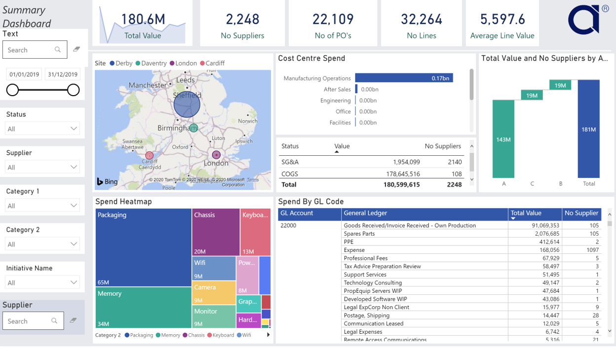
Spend Analytics Graphs create a visualization tool known as Accelerated Insight. Out the box list of graphs that combined create quality visuals.
Spend Analytics Graphs : Field list
Sometimes referred to as a Spend Cube or Spend Analysis. This allows data, to be connected, Power BI allows the user to create a template, using predefined spend analysis format.
The Spend analysis format is usually provided in excel. The following list of spend analytics graphs are shown below:
ABC or Pareto Analysis
Number of Suppliers
Number of Transactions
Spend Analytics
Average transaction costs
Currency
Invoice date
Unit cost
Total Spend Value
Data Visualization
Spend analysis Dashboard takes Spend data and creates a method for users to consume it, easily and quickly. Data Visualisation is essential creating insightful, data-driven cost optimization.
▶ YouTube