How to use a Procurement Spend Analytics Dashboard
Spend Analytics Dashboard
Spend Analysis Dashboard
How to use a Procurement Spend Analysis Dashboard
A Procurement Spend Analysis Dashboard provides a central location to aggregate multiple data sources, into a single trusted data source, that monitor, analyse and control. Creating a Spend Analysis Dashboard, aligned with the company objectives, gives procurement the spend analysis they need, to take the necessary sourcing actions required to stay in control.
Procurement departments, may use several different types of Dashboards, the following list provides sample examples of procurement and spend analytics dashboard (s) :
Procurement Savings Dashboard
Supply Chain Dashboard
Category Management Dashboard
Procurement Supplier Performance Dashboard
Why a Spend Analysis Dashboard is important?
Spend Analysis is an important method of Spend Data Visualisation, Supplier Sourcing, Cost Saving and Budget Tracking. A Spend Analysis Dashboard is a way to visualise, simplify and share complex information, in manner that provides procurement management with timely and accurate spend analysis reports.
Spend Analysis Dashboard: Video Tutorial
Spend Analysis Video explains the four Standard views and provides a executive summary of the Procurement Spend Profile, including the company, procurement category, and spend profile for each supplier.
Spend Analysis Dashboard video will show the Following
Organisation Summary
Supplier Summary
Line Item Review
Text Analysis
Spend Analysis Dashboard Tutorial
Supercharge your procurement game! - Reserve a Demo Today
With our assistance, you can maximize your procurement strategies. We provide quick, hassle-free access to valuable data, helping you make informed decisions.
Our solution is all about shaking up how you handle procurement data. It's customized to tackle your unique goals and challenges head-on.
Imagine having a personal procurement assistant that boosts your efficiency using your data. Find hidden gems, spot cost-saving opportunities, and dive into smart procurement moves.
Why wait? Grab a free demo and unlock the full power of your procurement data. Reserve your demo today!

Accelerated Insight
Improve your procurement game

Spend Analysis Heatmap Graph
Heatmap Graph
The Heat map chart, is designed to give a quick representation of the high value Spend Categories.
Chart (Spend Analysis Heatmap Graph), is a visualization of a company’s annual spend.
Showing which categories have the highest spend value and is denoted by the size of box, the larger the box, the larger the spend value.
The Heat Map Chart represents data in a tabular format with standard colour ranges, the size of the Boxes, represents the highest Spend Categories.
The Description at the top of each box represents the Level 1 Category, at the bottom is the annual spend Value.
Other attributes can be added like No of Suppliers, No of orders etc.
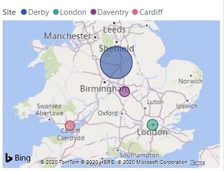
Spend Analysis Company Map Graph
Location Map Graph
The location map is a standard offering within Power BI. Within Spend Analysis Dashboard this chart is important as it can show the following:
Facility location, Depot, Office, Workshop, Plant etc for the Client
Can show the location of each supplier
these charts can me created using the name of the city or town, with more precise location using Geo Mapping Latitude and Longitude co-ordinates, this chart gives and an example of the location, the size of the Circle indicates the spend value, this shows at a glance the locations with the greatest spend denoted by the Bubble size.

Spend Analysis ABC Pareto
Waterfall Chart
A waterfall chart, is a data visualization that helps in understanding the cumulative effect of sequentially introduced positive or negative values. These intermediate values can either be time based or category based. In this case the Waterfall chart has been automatically put into a Category called Pareto analysis.
The Spend profile data is automatically categorised into 3 buckets,
A = 80% of the spend value, typically 20% of suppliers make this up. This is where the highest spend Suppliers are based.
B= 90% of the Spend Profile Value
C= 100 % of the Spend Profile Value - Sometimes referred to as the Tail Spend or Long Tails
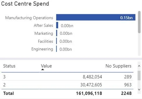
Spend Analysis Cost Centre Graph
Cost Centre Spend
Within Spend Analysis, it is very important to see the department or cost centre a transaction is booked to. For Spend Analysis, each transaction will have been processed using the The chart of accounts, each purchase order or accounts payable information, will then have to been aligned into the financial systems.
Each department will hold an annual budget, which each month this is reconciled to show the status and remaining value for the budget holder.
Within a procurement spend analysis, it is important to know who you spent money with, but also, who in the company bought the goods or service and which functional area will this cost be booked to. Cost Centre Information is key, because many functions may have their own preferred supplier and in some cases procurement may offer an alternative cost reduction or service.
Procurement function works to provide sourcing, that should have the budget holder as an integral part of the sourcing decision.

Spend Analysis GL Graph
Spend By General Ledger
Spend by General Ledger codes, are taken from the Company Chart of Accounts, they provide procurement with a map of the internal financial reporting structure, and supports analysis. The Ledger is a financial system, normally two entry that first receipts goods or service then allocates them to a cost centre, thus helping the Spend Analysis process.
The table called Spend Analysis GL , shows an example of this from our test data, It shows the General Ledger account, the General Ledger Description, the Spend Value or Spend Profile and the number of suppliers per code.
In many cases, the GL codes, are pretty high level and don’t support in depth line item classification, however, is some case General Ledger codes are use directly to Classify as a first pass, there are other factors that need to be taken into account, such as Item Description or PO Description.